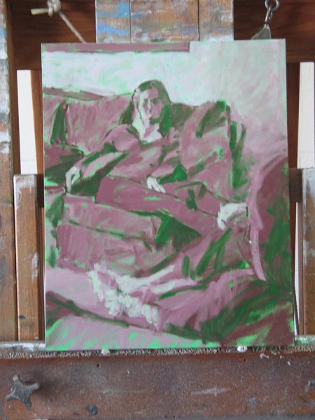
January 7, 2018 -
There is a problem with the real What's New Page - it shouldn't go all the way back to these archives. Working on it!
March 5, 2012
My friend Bob sent me a link to pictures of artists' palettes, and in order to ascertain whether Van Gogh was really a lefty, as his very Van Gogh-like palette suggests, I googlized VG self-portraits, where I found links to this fabulous photograph:

I'd only ever seen the well known photo of Theo, and two more or less likely ones of his great brother when he was a child and an 18 year old. If this one isn't himself, supposed to be taken in 1886, it ought to be.
February 23, 2012
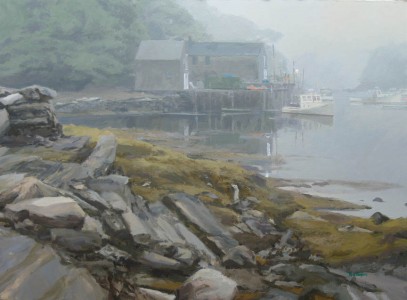
I've added another France painting or two in Greatest Hits.
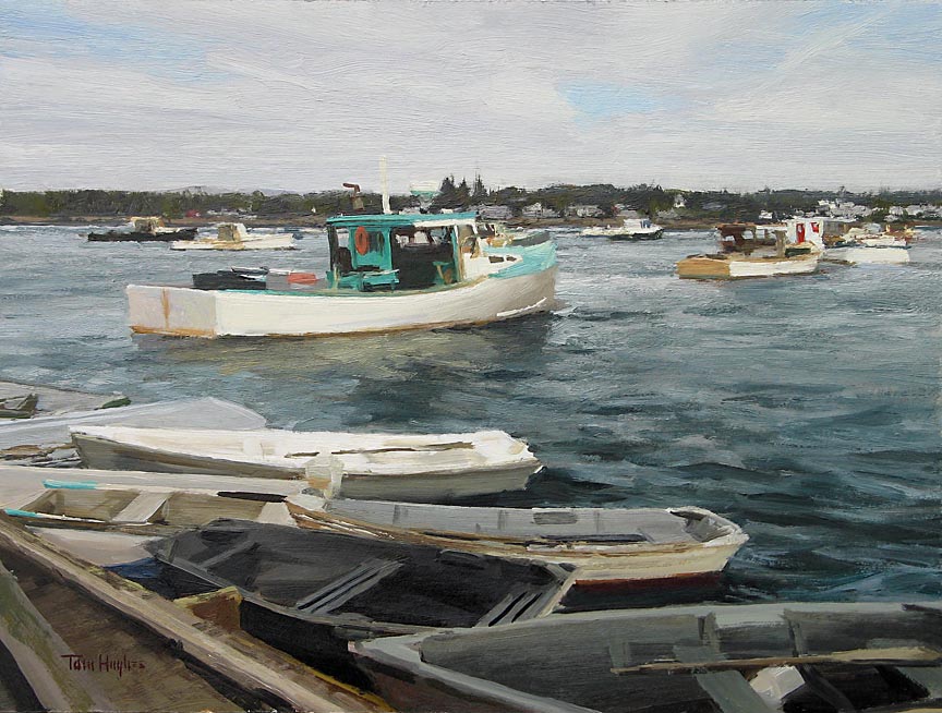
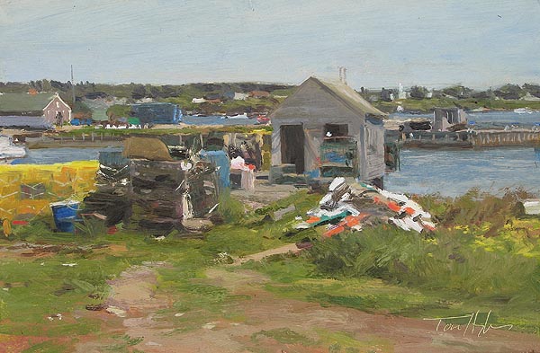
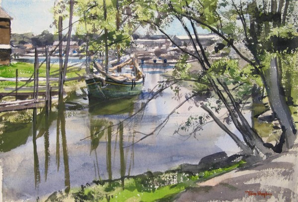
Fishing boats in Faro, Portugal: painting inspired by a 1990 trip with my brother where I was painting watercolors.

Mending Nets oil on canvas, 30x36
February 18, 2012
Couple nice pictures here
btw, they're for sale
Sunny morning oil on panel, 24x36


Sun and Stone acrylic on panel, 24x32
February 12, 2012
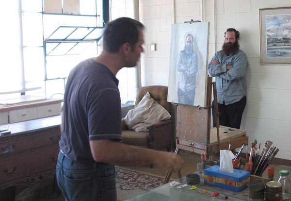
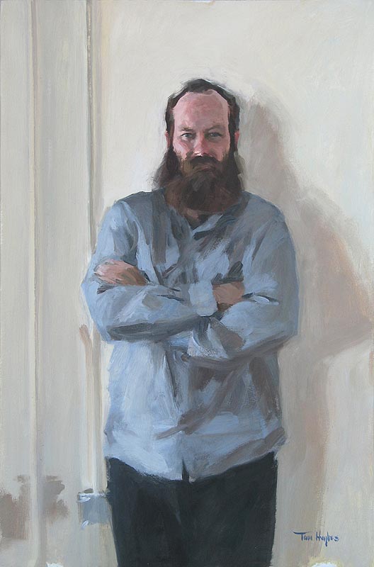
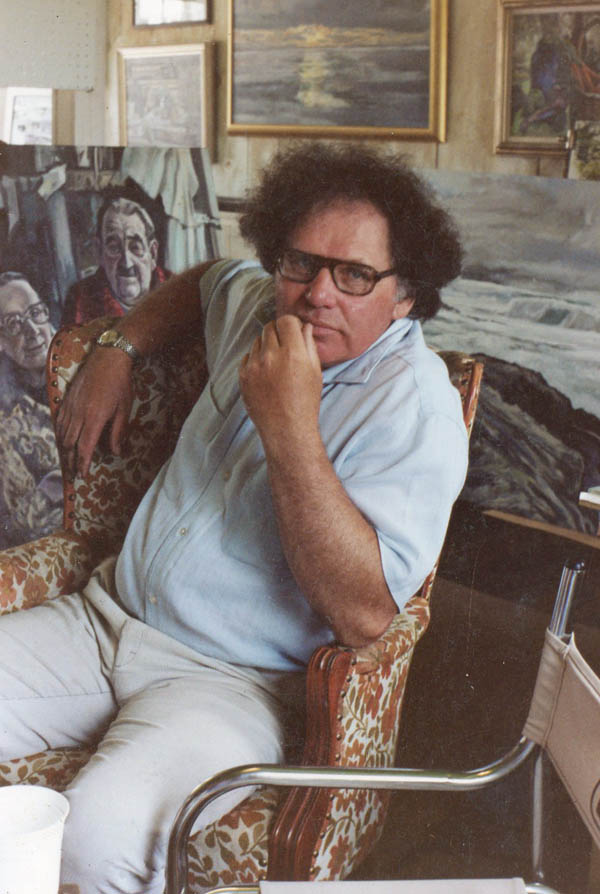
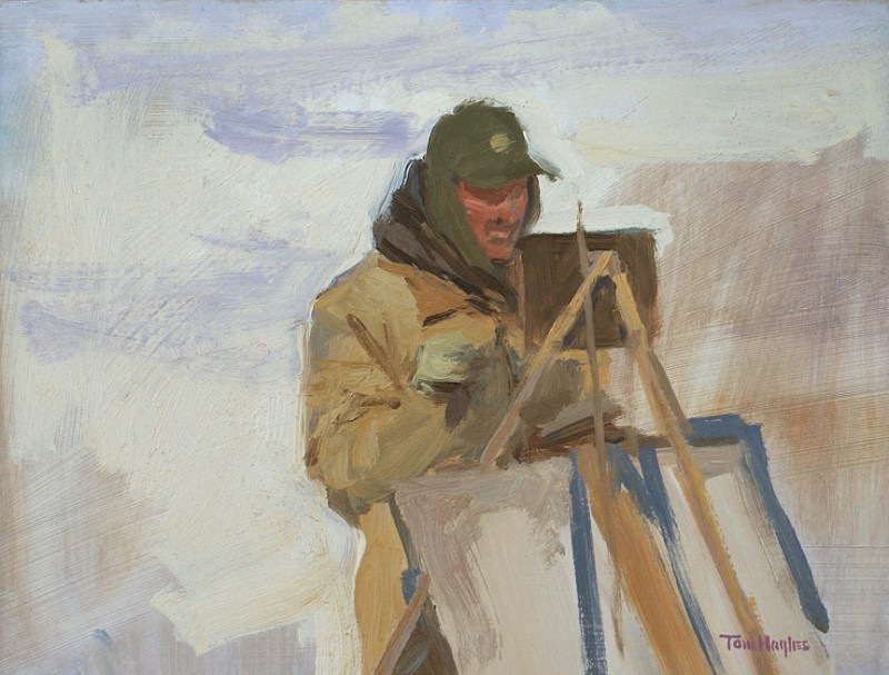
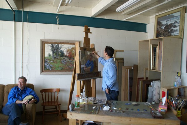
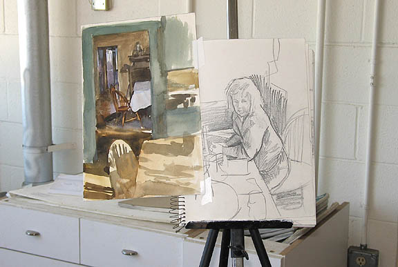
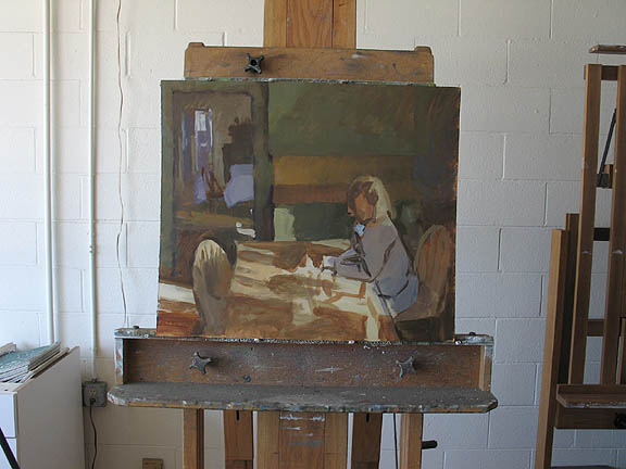
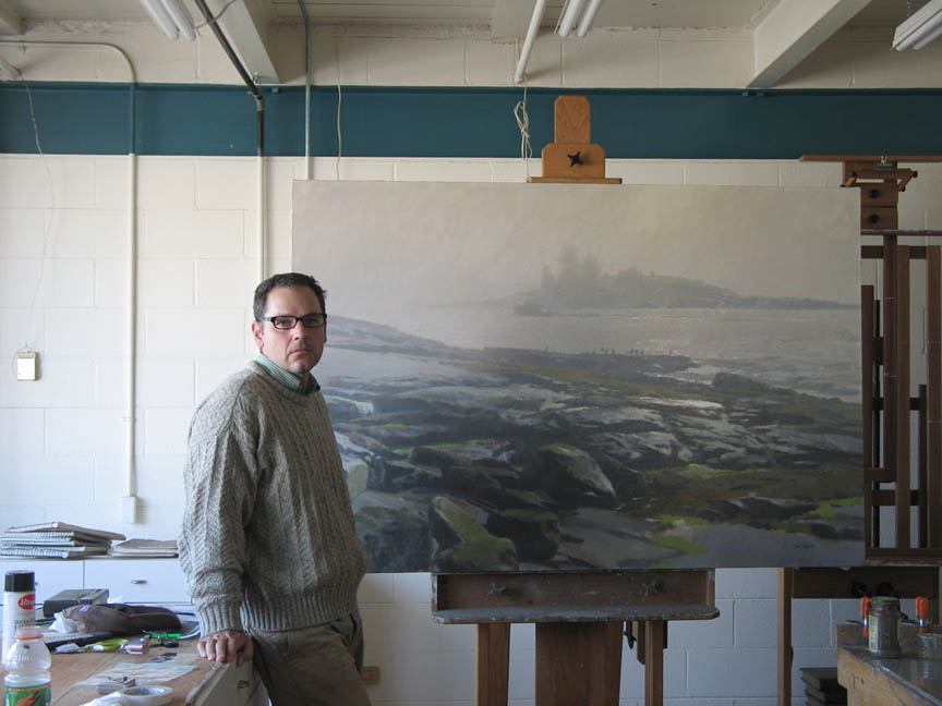
The picture on the left was painted at the Berkeley City Club, in the foyer: oil on panel 18x18. Pic on the right is of me working on a portrait upstairs in the club. I'll post it when it's done.
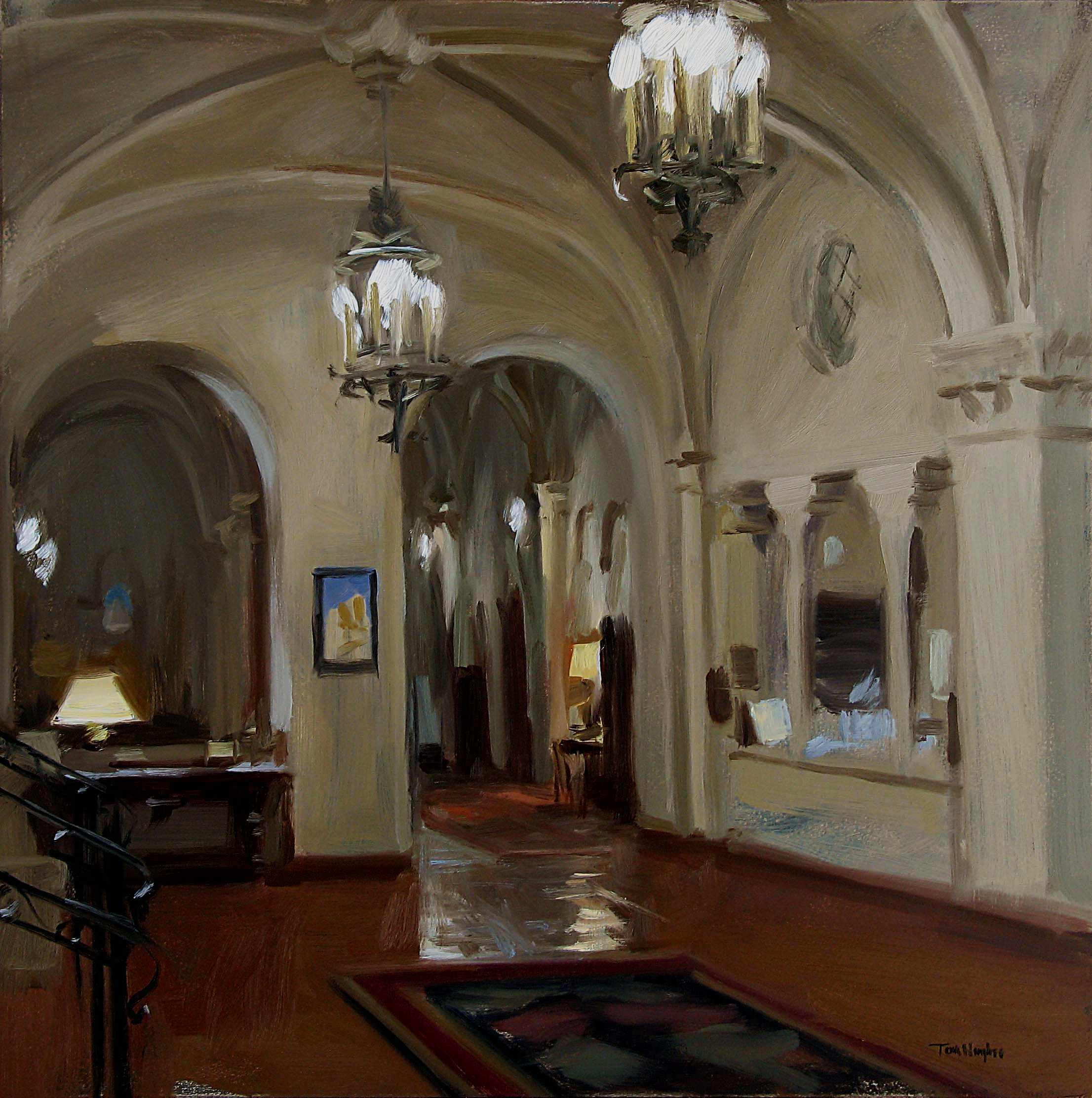
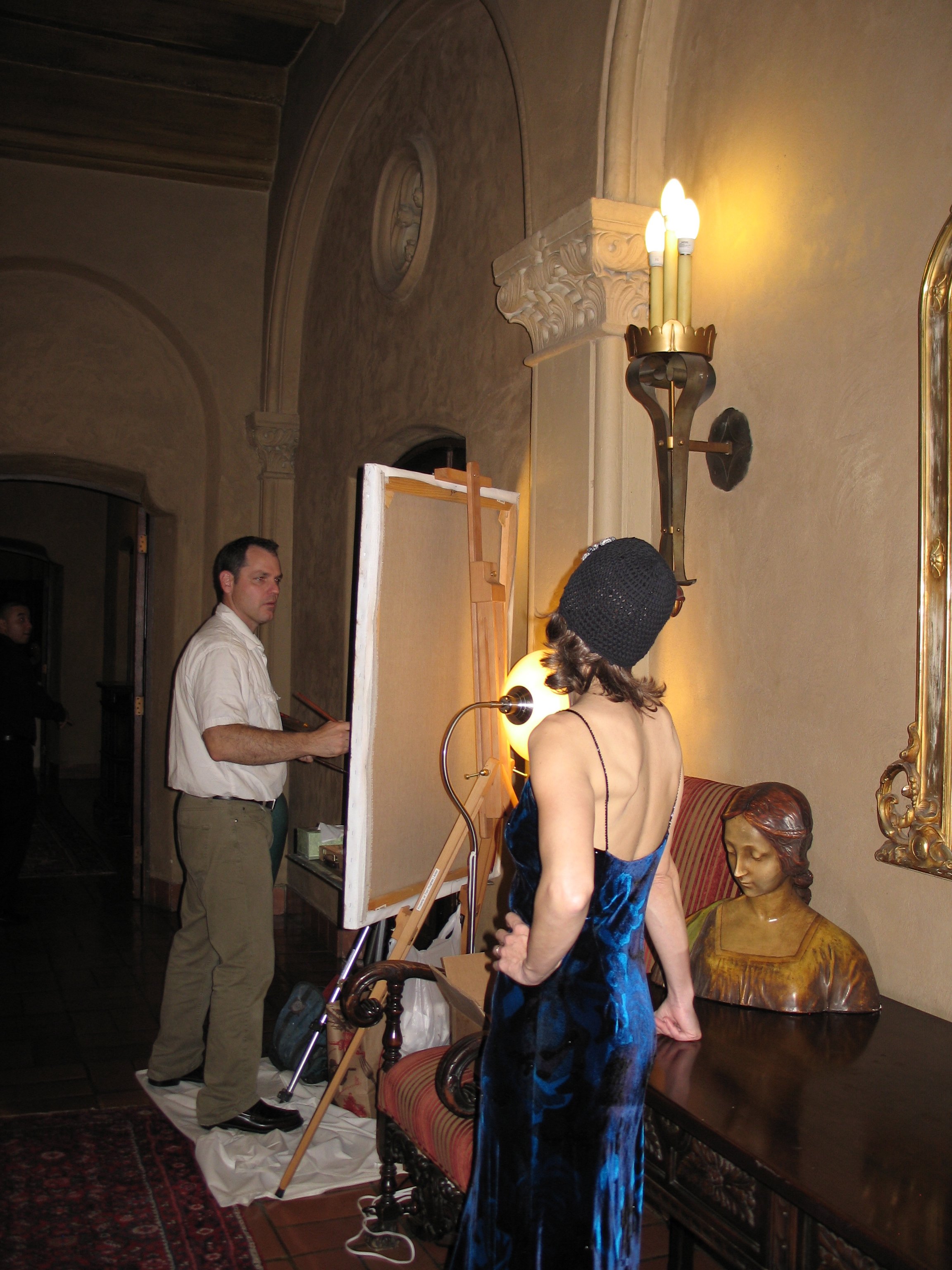
photo by Charlene Hughes
February 7, 2012
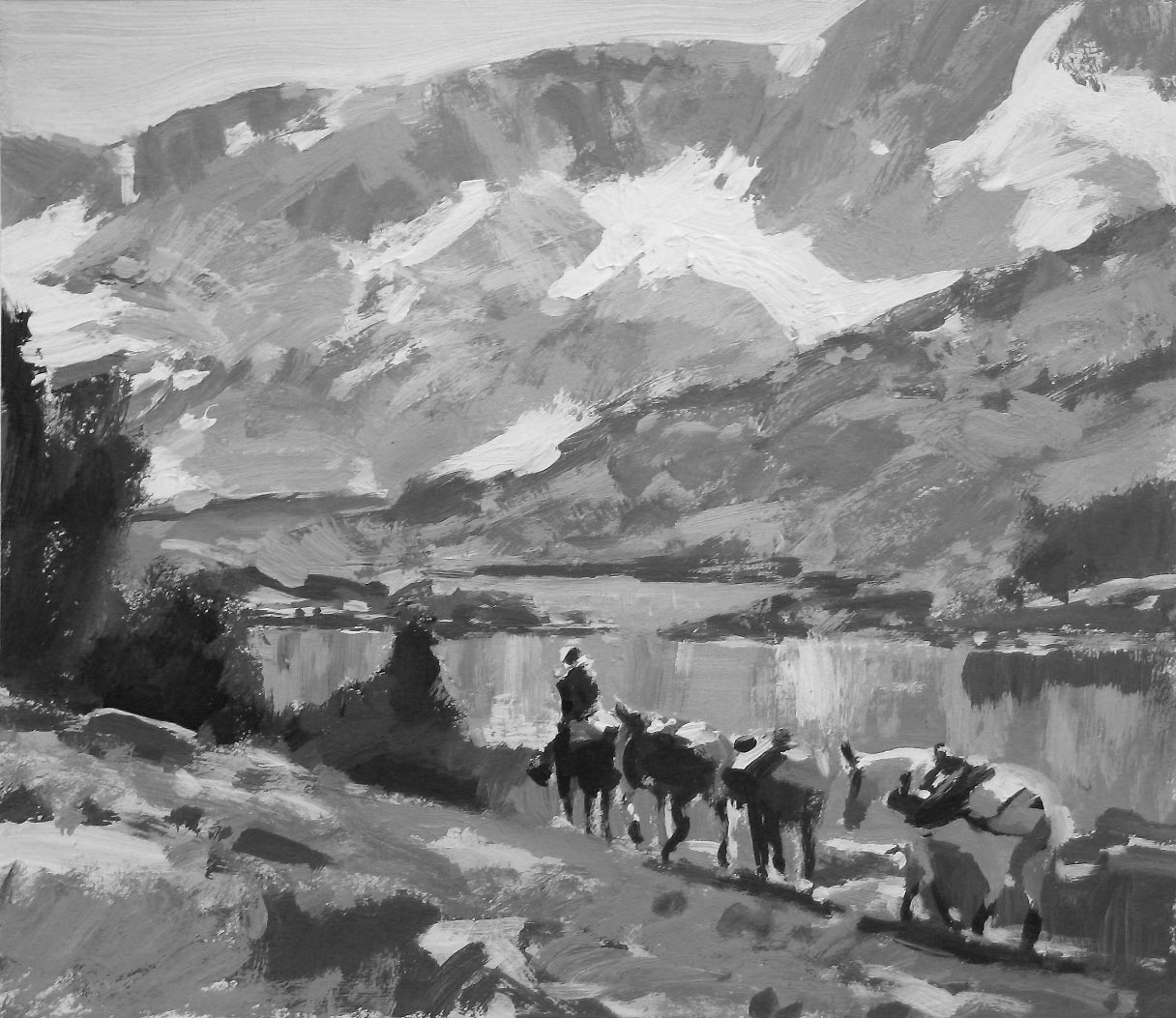
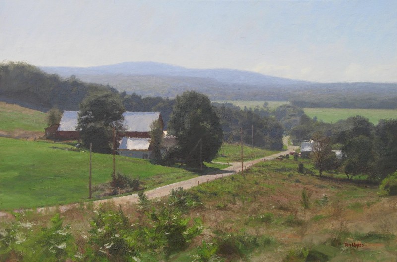
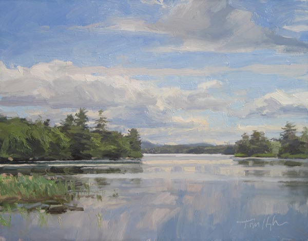
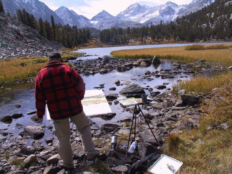
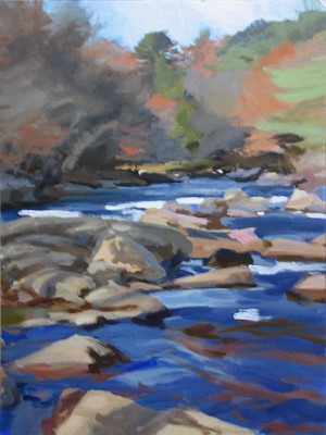
Still mining a 2006 pack trip in the Sierra Nevada:
oil on panel 28x30
December 10, 2011
Added a couple things to the Greatest Hits department today, also unplugged the blog (see November 12 post).
November 13, 2011
I'm rearranging the Gallery section: the thumbnails with price ranges listed below them open onto pages that show paintings which are available for sale directly from me, those with gallery names under them open onto pages that show paintings currently available in those galleries - self-explanatory I hope.
To facilitate the sales function of this website, I'll be introducing a shopping cart feature very soon - this week I hope. And I'll be correcting and adding to the information about individual pictures in the galleries. Plus more paintings.
November 12, 2011
I've activated the blog function on this website and will post my usual What's new material there, unless I decide I like this format - omnipotent and unanswerable - better.
October 20, 2011
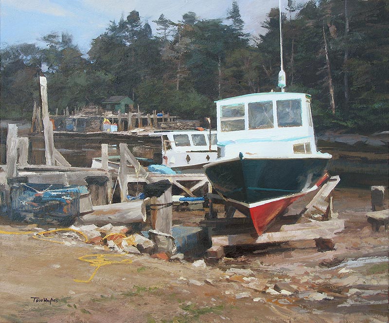
In for the Evening, oil on panel, 24x36. Available at The Bayview Gallery
July 22, 2011
Here's a little painting of Bernard Harbor, on Mt. Desert Island in Maine
oil on panel, 12x16
July 8, 2011
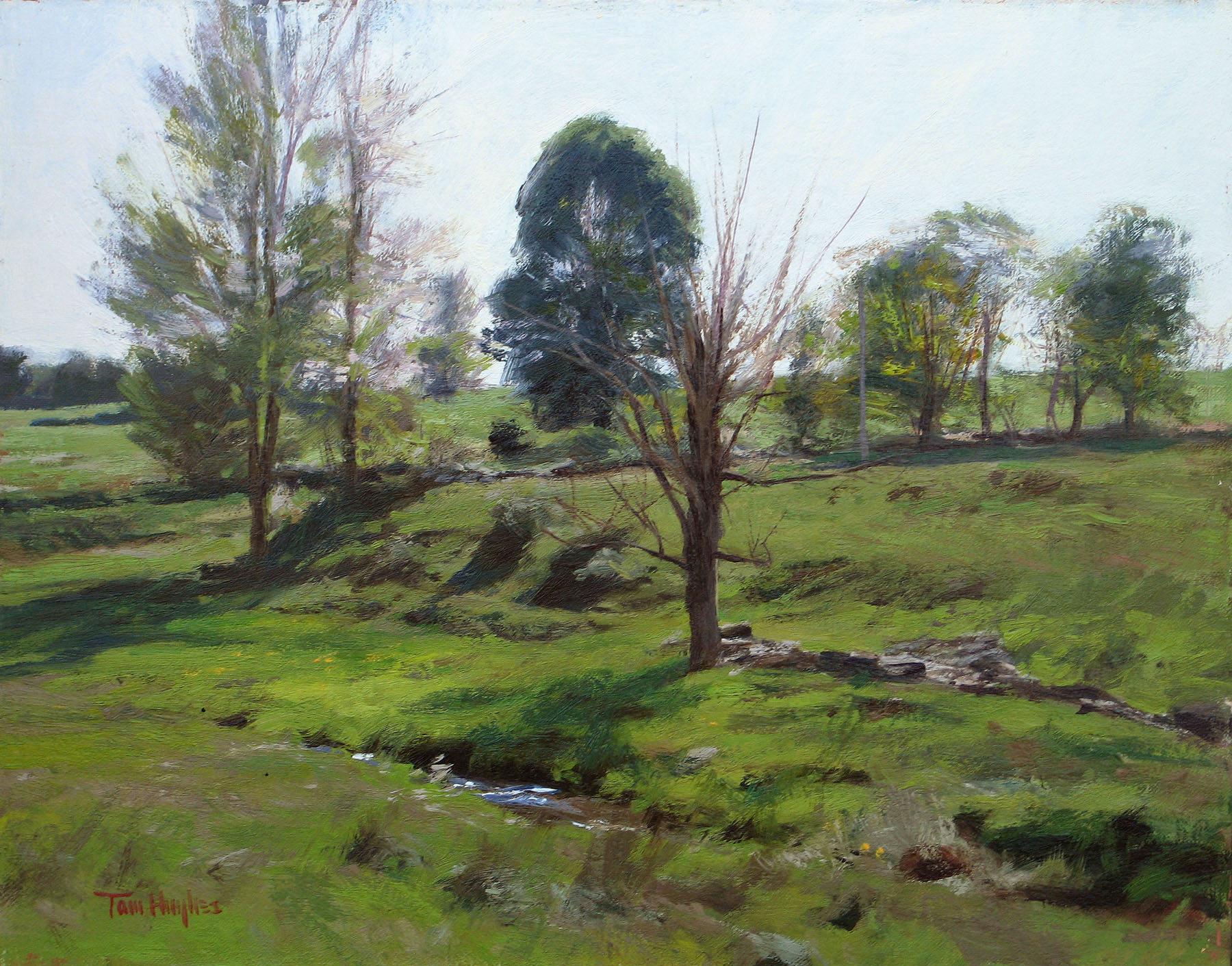
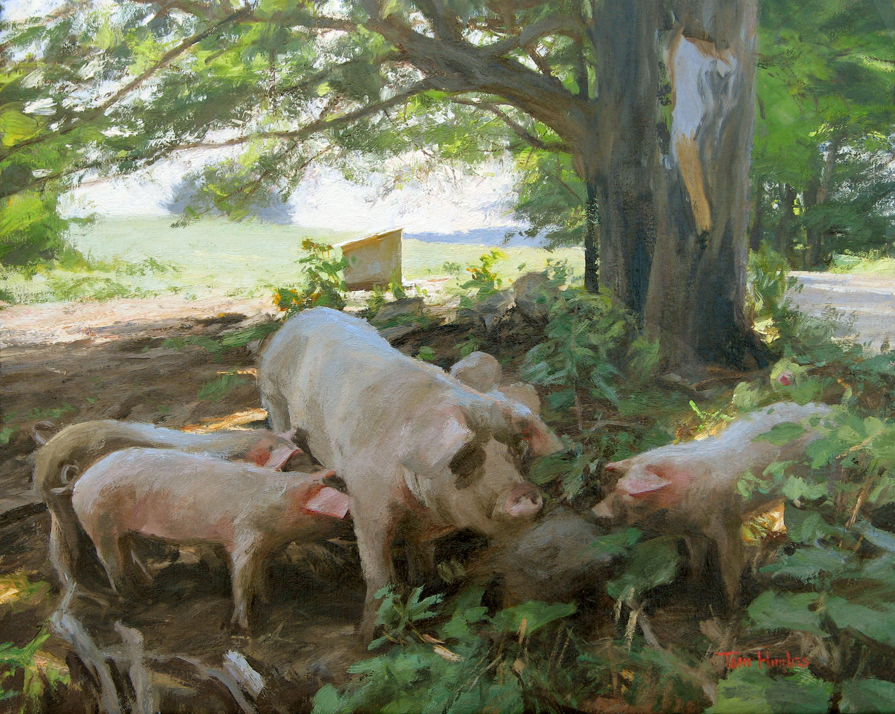
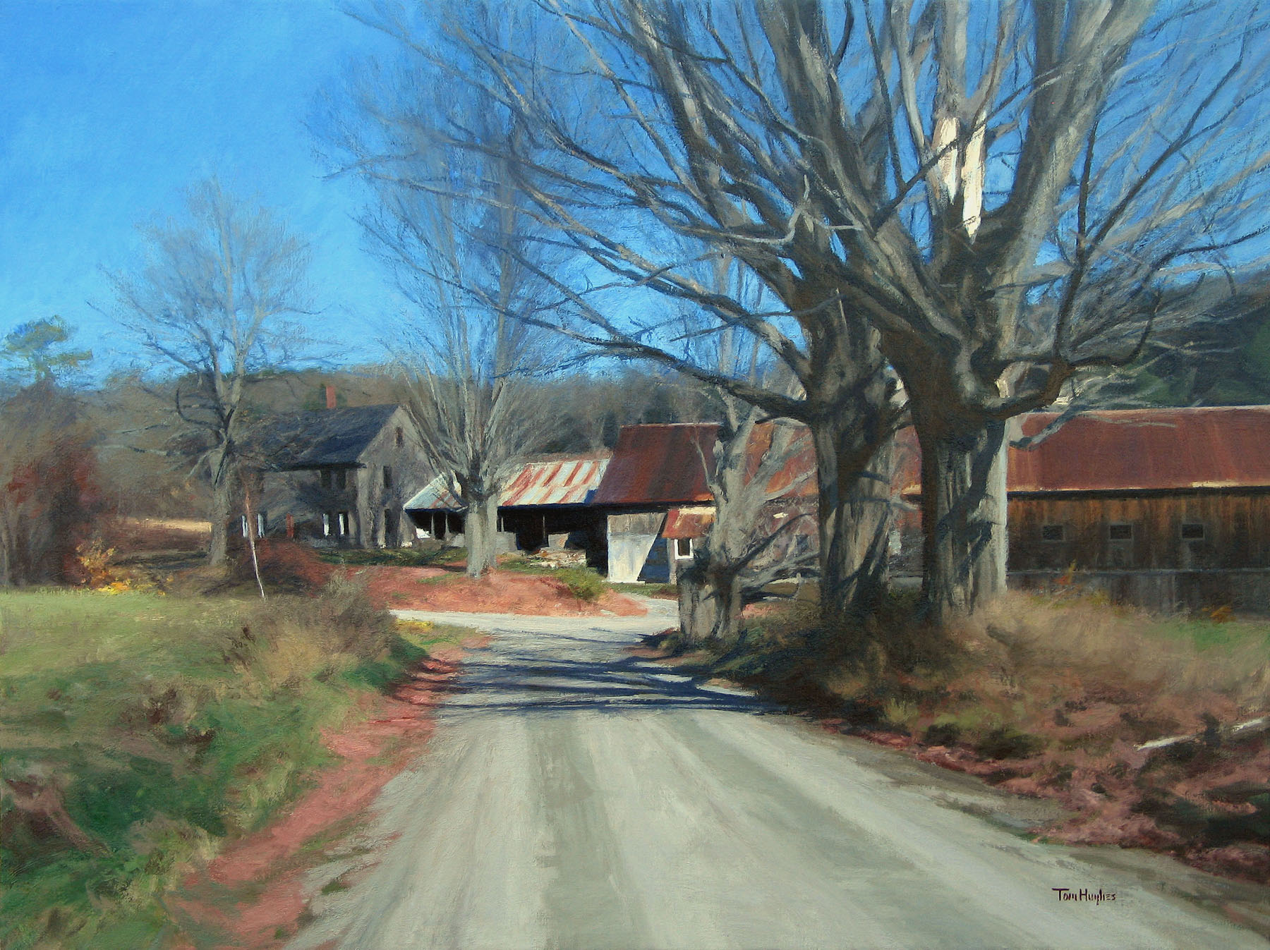
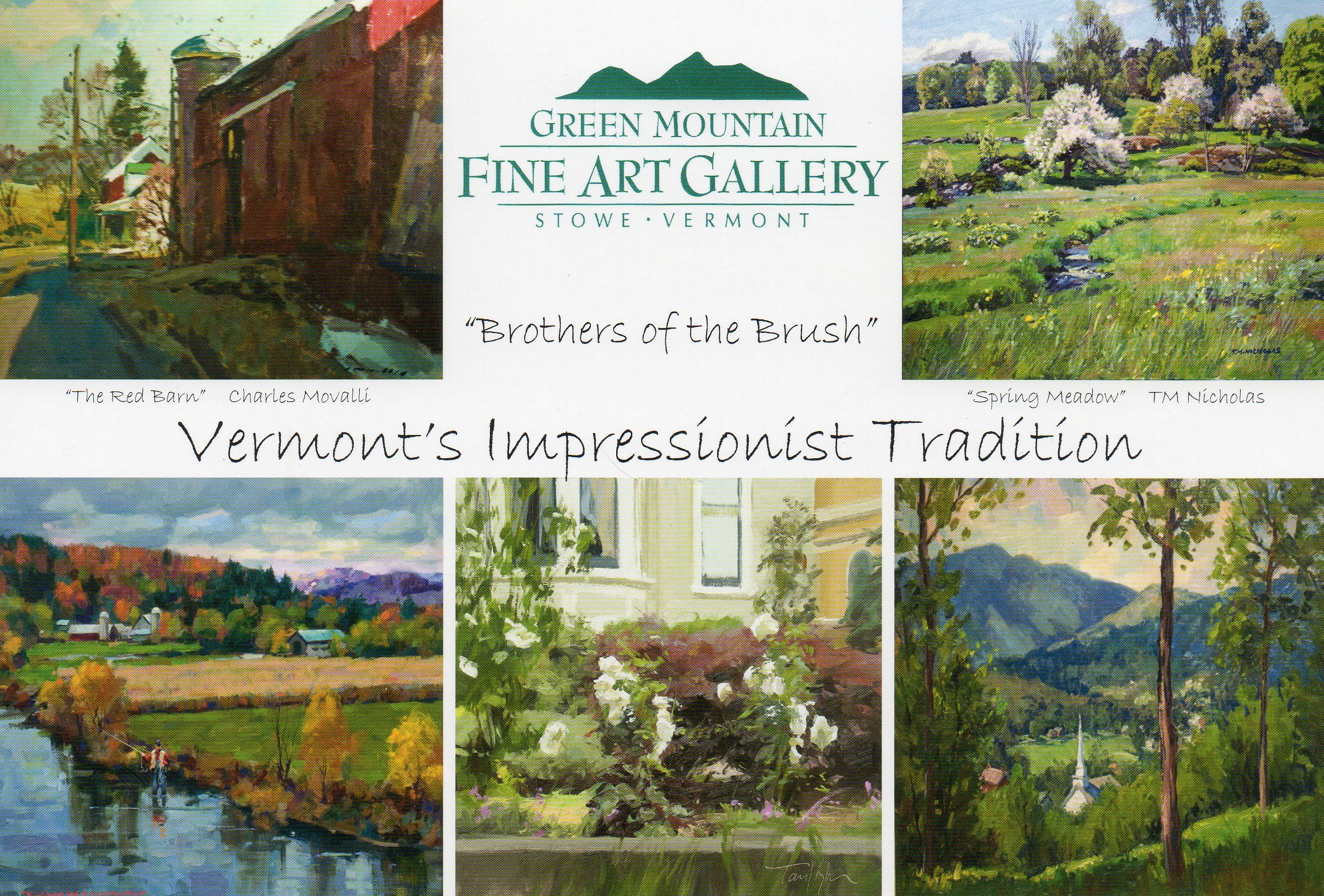
Here are a few of the paintings going in the Green Mountain Fine Art show
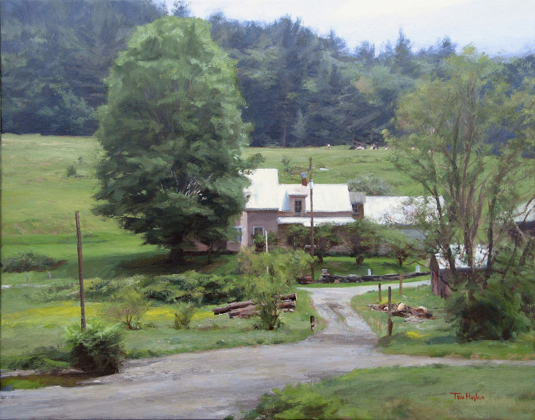
This is the Chase farmhouse in Cambridge, VT, oil/canvas, 22x28. The next is a pasture, not far away, oil/canvas/panel, 11x14.
Pigs, oil/canvas/panel, 16x20.
And a fall picture, all the leaves down, but warm. Oil/canvas, 30x40
June 30, 2011
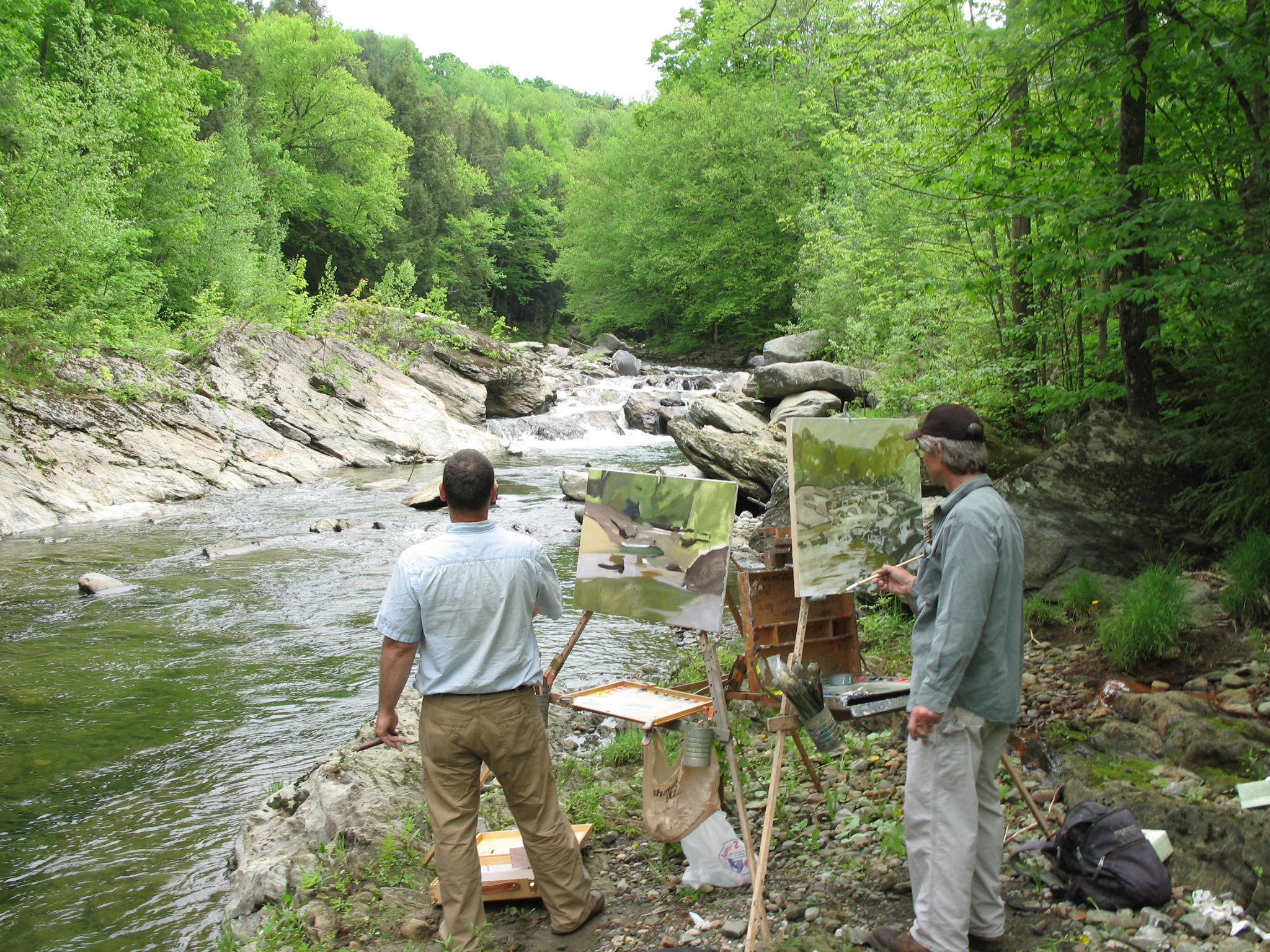
I went to Vermont last month to prepare for this show; still working on some of the pictures, which I'll post - the good ones anyway - when they're done.
Here I am, on the left, painting with T. M. Nicholas in Montgomery, VT. Note how different our paintings look; his always seems done as soon as he starts.
May 17, 2011
I went out yesterday despite rain - stood under the open hatch of my Jeep and painted this:
Roses, oil/panel, 12x16.
May 15, 2011
Here's the latest painting signed, a picture of any hilly place that gets snow, sun and has pine trees.
Winter Sun oil on canvas 28x30
I posted my version of this in June of 2009, but only now came across Eric's blog post regarding my painting of his portrait:
http://ericrhoads.blogs.com/the_portrait_project/tom-hughes/
He says very kind things; there are also links to his other portraits in The Portrait Project.
May 15, 2011
yours truly, upper right
May 5, 2011
I haven't been out to paint since January - a sad lapse - until last week. Then yesterday and today I did a couple little local paintings, pictures of not much, getting back up to speed. Beautiful summery days here, just this side of hot.
These are both oil on panel, about 8x12:
This one is from a little boat landing park in Oakland, looking across toward Alameda.

And this is not far away, looking across Interstate 880 into Oakland, toward the hills. The generally tonal sort of painting I do, I don't often get to bale the cadmium yellow right to it like this.
May 5, 2011
The Bayview Gallery has a group show opening next week, Friday May 13, called A Taste of the Season: two of my latest pictures will be in it - you're all invited!
May 1, 2011
The mule picture from the last update took a lot of time and work. Previous to the present version I'd worked like mad on a somewhat different design, or more accurately a more comprehensive view - which when confined to four sides becomes design anyway - and couldn't bring it around. Here's the beginning point: a little monochramatic sketch I'd done in acrylic a couple years ago to show to a woman who called me saying she was interested in Sierra Nevada pictures, wanted to come to my studio and look at paintings: did I have any, preferably with horses? or something like that. Came by the studio, seemed only to want to case the joint, see what kind of brushes I use, who knows...? It was a total and irritating waste of my time.
I then flubbed a full-sized oil based on this:
Changed it a bit, started over, did the picture below.
I still like the sketch.
April 27, 2011
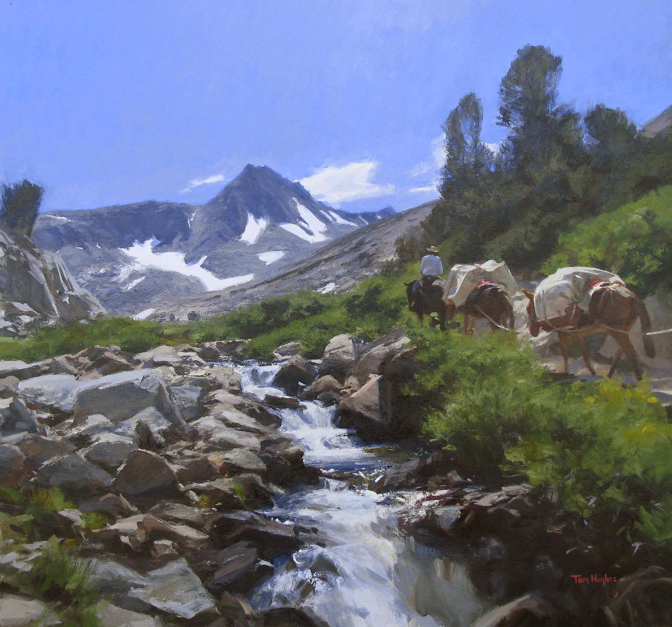
Still mining the 2006 trip to the Bishop Pass area in the Sierra Nevada that I and a few other painters went on:
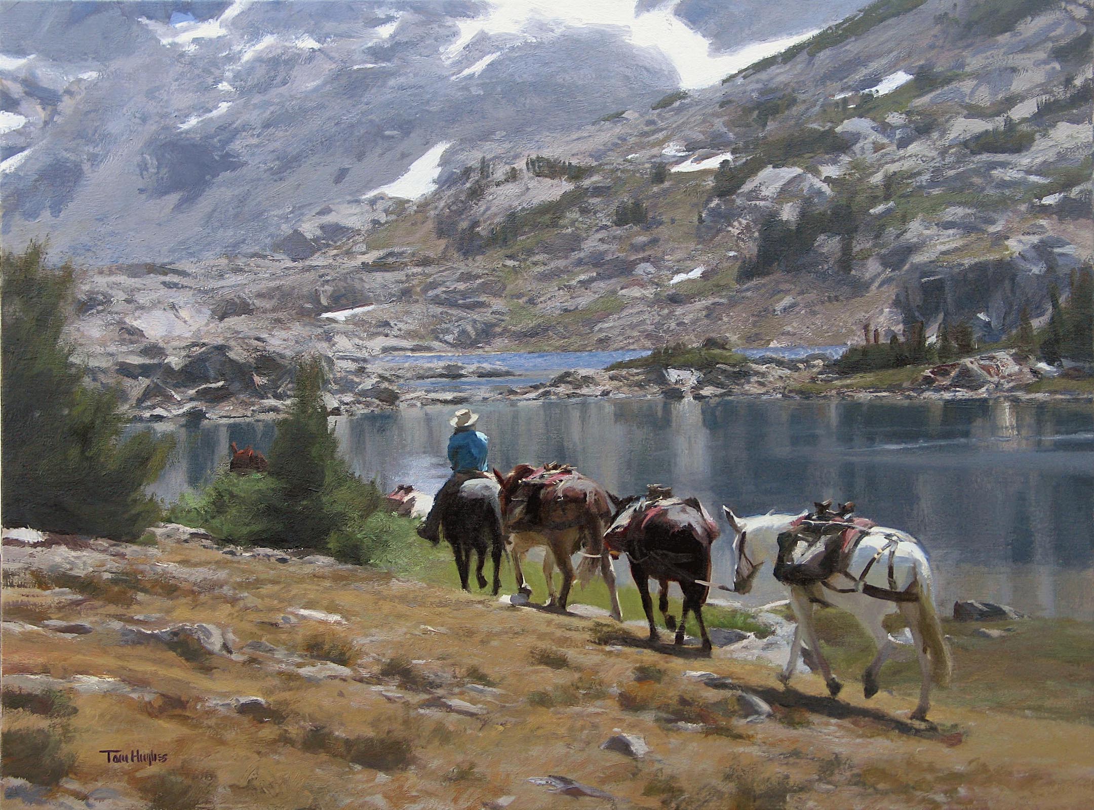
Sierra Pack Mules, oil on canvas, 24x32
You employ a pack station to load your gear - tents, food, paints, whatever - onto their mules, and then you hike up to where you'll be camping. The packer meets you there where he/she/they unload improbable quantities your stuff from the very stout heavy-duty leather packs draped athwart the mules' backs. They plop it on the ground and then leave with an agreement as to when they will come back for the return trip. The picture shows them unladen, heading back down.
btw, if you want practice painting rocks, go there.
April 1, 2011
Saw this in the readers' response section of The Guardian's art blog:
Many are prepared to suffer for their art; few are prepared to learn how to draw.
December 26, 2010
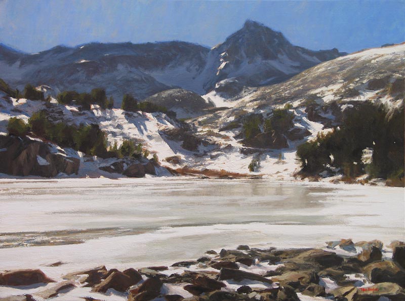
This is a painting from the margin of one of the Gem Lakes in the Little Lakes Valley in the California Sierra Nevada. It's tough to convey the effect of the blinding backlight - which rendered objectively in it's correct values would look like black and white neon - and show the color. There's a lot of splitting the difference here; dark tones lightened enough to show the reflected sky in the shadows and the lit up snow darkened sufficiently to include some modelling, all done while trying to bring across the high-contrast effect. I don't know what I'll do if they ever come out with radioactive paint.
December 23, 2010
Spotted in the wild
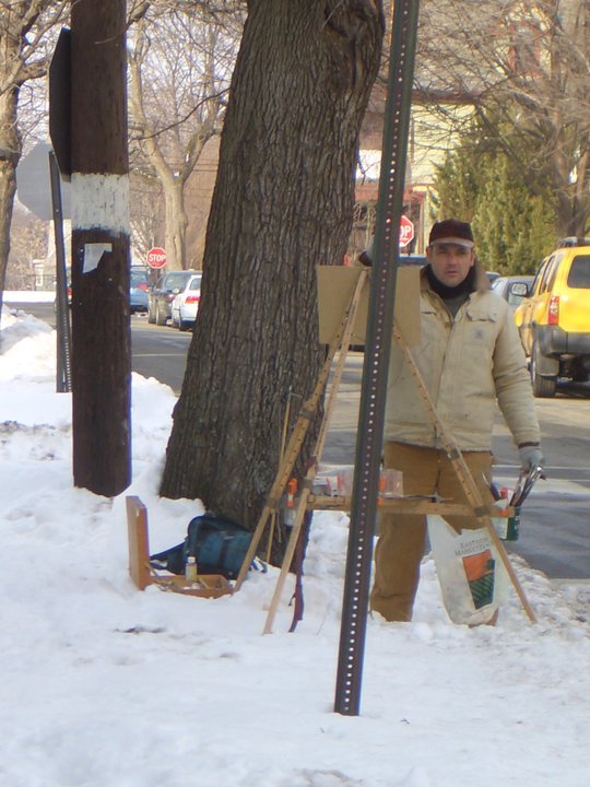
photo by Sarah Hughes Stone
November 27, 2010
I just finished a picture started on location last July, which is fairly quick for me; I usually seem to wait a year or so before picking up trip-paintings to work on.
It's northern Vermont, a beautiful day though hot. To my right: Eric Tobin and T. M. Nicholas

October 28, 2010
Here I am painting Shawn Connelly last week
and here's the result
October 18, 2010
I did this half-sheet last year while housesitting at/near a horse ranch/vinyard:
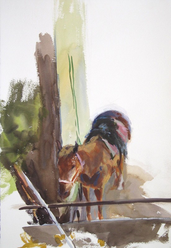
I recall being frustrated but unsurprised that the horse was led away before I was anywhere near done - didn't even have time to sign it, but now it looks okay to me; better, probably, than if I'd had the time to finish it to death.
October 10, 2010
I painted this in Sonoma a few months ago - though I suppose it could have been done almost anywhere:

It's notable that for such a green painting I used no green pigments; all blues and yellows, reds or browns. I typically have one green on the palette for outdoor painting but it's just for convenience unless a particularly pure, bright note is required. The convenience color is really tempting to reach for: you see something greenish, you think "green" and automatically run a brush into it, then modify it with other colors, but it's instructive to have to come up with all the variations without actually using something labelled "green."
Personally, I'm at once motivated by the dual impulses to puritanically cut my palette down to a minimum of colors and alternately to deploy a wide variety of them thinking it would be fun to see what happens when I mix, say, cobalt turquoise with naphthol red. Being a more or less tonal painter, I just about always end up in the same place; I also derive an unsophisticated satisfaction from getting the painting to look like the subject, at least when I'm working from life.
Here's another picture, related to the above in no way except that I painted it in Sonoma and that it betrays my great fondness for painting trees: it's a full-sheet watercolor done on a winter afternoon; the atmosphere is pleasantly veiled, the vine's leaves are reddish or absent:

In retrospect, the touchy dry-brush work in the densely twigged oaks makes the rest of the painting seem like it must have been child's play by contrast, but unless you're in the zone from the beginning, the whole thing seems terribly contingent right up until you sign it. Even then: Don't flub the signature, it's watercolor! Something even a genius like Sargent referred to as "making the best of an emergency."
I'm not so frugal about the number of colors I squeeze out for watercolor. There are typically 18-20 versus 4-12 with oil. The real workhorses are ultramarine blue and whatever complementary color I mix it with for the neutrals, but the independent beauties of some of the pigments show to greater effect in watercolor than oil or acrylic (at least in the way I use them) so that cerulean blue (the genuine stuff, cobalt stannate; PB35), for instance - a really delightful semi-transparent, granulating sky blue - is a staple in the former medium and a costly rarity in the latter two.
September 12, 2010
I've just rearranged the gallery section a little bit - two new galleries into which pictures from existing galleries have been diverted. The one is paintings which have been sold, so it's an unthematic group; the other is oils which have been painted alla prima or au premier coup or "all at once" if we're going to be pretentious. The latter group doesn't include the watercolors, currently quarantined in their own gallery; I always do those in one go.
More pictures to come.
August 15, 2010
James E. Hughes 1929 - 2010
July 26, 2010
Back home. I wasn't very conscientious about photographing the paintings I did in New England. Some pictures aren't finished yet, one or two are already sold, eg:
This is a Lake Winnipesaukee-NH-region alla prima job, wherein "alla prima" may be taken to be Italian for "greasy;" the paint took weeks - really - to dry on this and on others I did out there.
Here's another little one-shot done in an undisclosed location - a witty local lady was concerned that our paintings not be too beautiful since she didn't want the place overrun by awed visitors -
- though you should be able to figure it out from my June 21 post or by going to www.bayviewgallery.com where the info is right in the title.
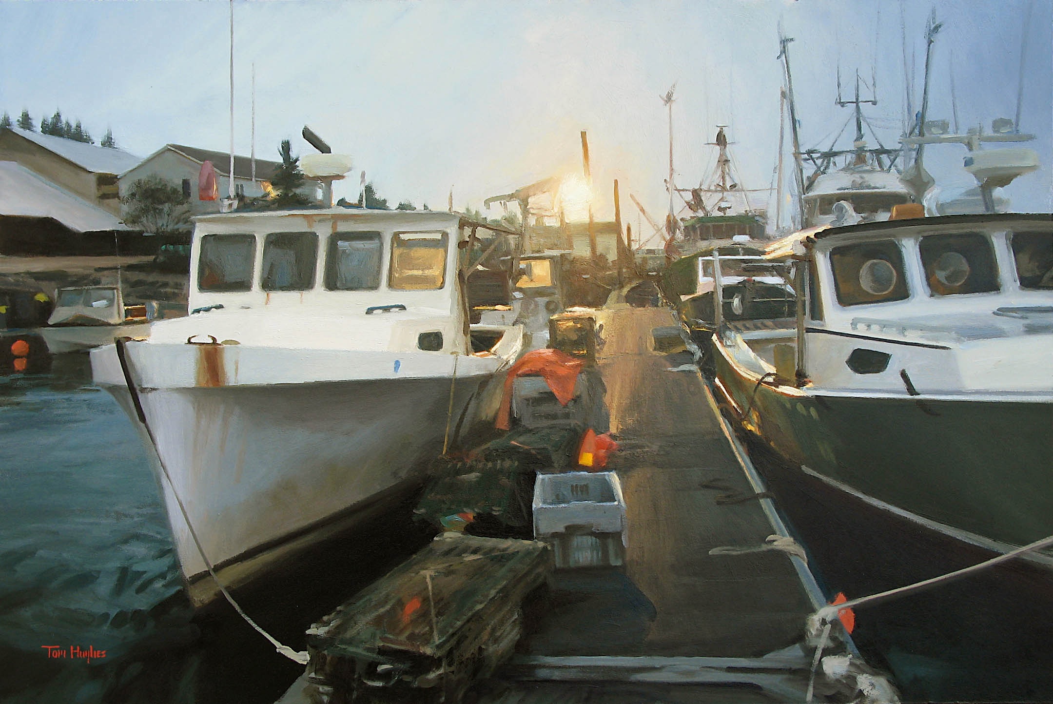
Another small one, also available at Bayview:

Hulls make pleasing shapes -
Jonesport, ME 20x24
June 21, 2010
I've been in the east for the past few weeks, painting in New Hampshire and Maine. No photos of paintings at the moment but here's me working on a sheep sketch -

This is at my cousin's farm in western New Hampshire; beautiful place isn't it? The sheep of course move around as much as people do, so I'd blob in sheep shapes and wait for one or another of them to assume some similar attitude, then grease in refining marks; not so tough since they're all engaged in the same repetitive activity - grazing. Not so easy either, since I rely on looking and darting and have no acquired knowledge of ruminant anatomy. I'll post the sketch when I take a picture of it, but it's strictly the basics.
Here I am painting on Beal's Island, Maine, accompanied by T. M. Nicholas, behind camera. I had him take these by way of plugging my brother John's nascent motorcycle racing career. The day we were painting there was a race day back in California.


The picture I'm working on is the kind of thing I often do on site in California; urban subjects or work sites. Otherwise it was all Maine harbor pictures. Boats, like sheep, move. Obviously and everywhere they make lateral movements, and seem to make it their special responsibility to vex painters by scooting right out of the picture they're meant to be in. But way down east, the tide is really extravagant; in the Mossabec Reach, just today according to the charts, the change was 13 feet. It comes in or goes out almost at a walking pace, and as a result, boats move as much along the y-axis as they do the already-lamented x-axis; a boat floating at eye level will be tilted on the mud in a very short while - especially for painters, for whom time passes at an accelerated rate.
May 20, 2010
My cousin Alex Hughes is a caricature artist; here is his Tom Hughes:
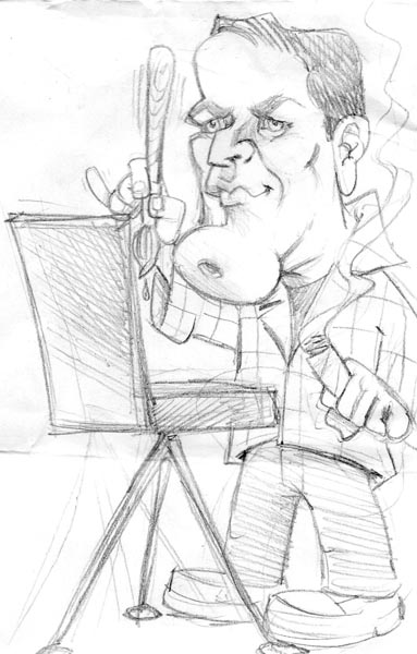
He came up with this after having made a few practice runs on the sly at a family gathering a couple years ago, not just drawing me, but everybody, trying out different emphases or distortions of each person until he arrived at the best likeness.
It's funny that in order to come up with a likeness when I do a portrait, I try to minimize exaggerations, whereas Alex's portraits are accomplished through exaggeration.
April 8, 2010
Decades ago, when I started to paint outdoors, I found that specific things gave me real trouble - in addition to the baseline trouble that everything entails - and I would paint in places or at times in which I could work on those things. One of them was skies. Another was what I call - excuse the professional jargon please - sticks: the masses and jumbled filigree of branches, twigs, brambles, etc that are everywhere in New England from autumn into spring. But whereas it's tough to make much out of a stick-painting, sky-paintings are another matter. Living in the SF bay area has put me seriously out of practice though; not much paintable happens in the sky here. It's usually either cobalt straight from the tube, or gray, or a sort of ripply gray.
A week or two ago we had skies for a while and in between rain storms I went out to do watercolors.
Believe it or not, this is my go-to spot to paint in Alameda:

Did that quickly, then turned 90 degrees to the right and did the next one:

A day later I went out and couldn't seem to do anything but clunkers. The sun was going down, sky was sort of weird, but I hadn't cleaned up yet, so I figured I'd give it a go on the flipside of the day's first mess.

This was really quick for me, done with one brush, a one-and-a-half-inch sable flat.
March 27, 2010
There is a loose thematic connection between yesterday's post and today's: wood.
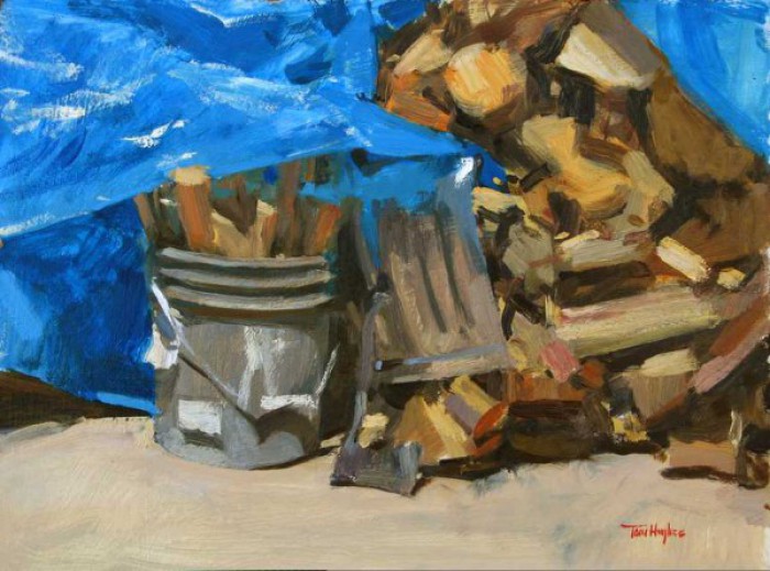
Otherwise the differences are substantial: this woodpile is a 9x12, yesterday's is 24x36; this one I travelled 4 feet out my front door, the other all the way across country; this woodpile took me a couple hours to finish painting, the other a couple million hours
March 26, 2010
This painting was started last winter - see February 18, 2009 post -

March 11, 2010
In my August 30 entry I posted a pink and green painting-start;

this is the finish -
Could it use a little pink and green maybe?
I'd been visiting friends in LA for a few days when I covered a few sketch book pages with the source drawings for the painting.
I also managed to get outside and do this -
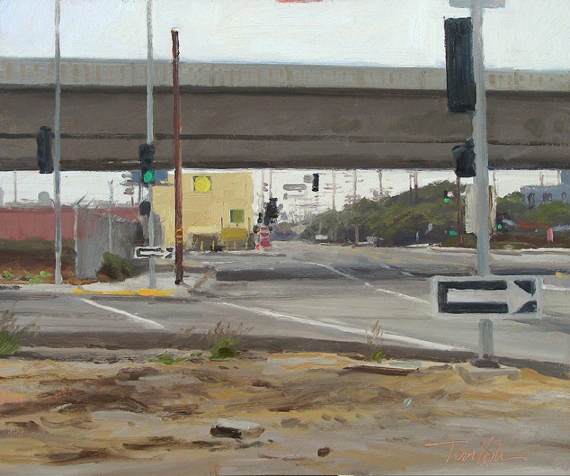
I can hear you now; "There must be some mistake. There is no conceivable time of day at the intersection of Culver Boulevard and Rt. 90 during which an infinity of automobiles may not be seen." Ok, you got me; it's really a post-apocalyptic Eden where there is no traffic and the lights are always green.
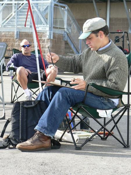
March 3, 2010
I did this about a year ago in Vermont
I was there with a few other painters, one of whom was Eric Tobin, the subject of my little sketch. It was really cold, around zero degrees (that's Fahrenheit, where zero is unambiguous) and I couldn't make anything out of the admittedly paintable spot we were in, so I did what anyone would do - look around for a painter painting to paint. I've done piles of them, look! here's another:
this time it's Jason Situ, in North Carolina
March 1, 2010
Last December I was in Ogunquit, Maine with T. M. Nicholas (in the photo below) for a couple days -
A couple very slightly notable things:
You can see a bit of the still unpainted-over pink imprimatura where the clouds will be in my picture; sometimes I start work on the white canvas, sometimes with a scrubbed-on color, sometimes over an old failure. When I start with an imprimatura it's usually a pale salmon-y rose. I have about 10 different reasons for it, none interesting except that I like the color; but I always end up blotting it out completely.
There's also a rock sitting on the crossbars of my easel and several piled up on the rear leg; I took the hint after the wind tilted the painting-and-tripod into my face the first time.
Looking at the relative finish of the two paintings, you might ask me if T. M. started his a day or two before I started mine, and I'd have to answer Nope.
Here's the finished painting, now showing at The Banks Gallery.
I see in the post below - from last fall - that I said I'd upload paintings from my show at Thomas Reynolds. I should have said I'd upload them next spring...
October 23, 2009
Here's a really nice blog post that Eric Rhoads made about our portrait collaboration (see my post below on June 29, 2009) http://ericrhoads.blogs.com/the_portrait_project/2009/09/tom-hughes.html
I've been in the studio pegging away at a number of canvases, panels, etc, for my show at Thomas Reynolds: less than 2 weeks away! I plan to finish another three or four small ones and a 20x30 - all figure pictures of some kind. I'll put the show up in the Gallery section when the stuff is fiinished.
October 13, 2009
The date of my show at the Thomas Reynolds Gallery has been changed from October 22 to November 6, 2009.
A while ago I came across this watercolor, a full-sheet done on the handmade Indian paper I've mentioned before in these posts:

I thought it might make a nice oil... No, scratch that. I didn't think anything about how nice the result would be; I just wanted to get in there again, into the image somehow. It's difficult to explain an amplified whim. Also difficult to satisfy one, but I brought it around eventually.

October 11, 2009
You might remember the subject of this picture, done last week, from my July 17 post:

It's Joseph Knight, visiting from New York. We thought it would be fun to do another quick portrait in my studio a year after the first one, and it was. Substituting cleverness for wisdom, I put that mirror on an easel behind the chair; thought I'd just daub myself into the picture while I was at it.

The Joseph part went fairly well; finished it in one go and went home beat, leaving a few muddy smudges where I was meant to be. There's no story here; I spent another full day filling up the Tom-shaped space. Incidentally, what Mr. Knight is looking at in the painting is the big Sargent book with the fabulous portrait of Lady Agnew on the cover.
In the end it wasn't nearly the work-out that this one was:

I did some sketches on board a ferry last year; here's the principal one:

I started a big painting not too long after, about a 50-inch square. Worked and worked on it. Started it in the colors I remembered, then changed over to the Zorn palette I've mentioned in previous posts. I changed the lighting scheme completely so that the intensity of the outdoor light matched that of the indoors. Then changed it back. Then cropped a few inches off of one side. Then did a small oil sketch to see if I could work some of the kinks out, put dogs in then took them out (there were at least three on the ferry in my field of view): weeks of work. Then I destroyed it. And started again, this time a little smaller, 40 inches by 30; not a square, but the same format as the sketch. Rinse and repeat most of this paragraph, except without the immolation at the end and you've got the result. You can see a partial sequence of only some of the sketches I used for this thing in the From Sketch to Painting slideshow in my Gallery section.
August 30, 2009
Actual news: I'll have an exhibition of figure pictures at the Thomas Reynolds Gallery in San Francisco opening on October 22.
This before-and-after makes me chuckle/wince a little:
1994 self-portrait:

and today's impromptu re-creation/tableau vivant:

There, that's my leap back into blogging after 6 weeks out of it; I stepped off my little soapbox because I lost my camera and only today replaced it.
Here's the first pass at a painting I started the other day; it will be in the upcoming show, depending*:
 *depending on whether I finish it and it's good enough to be let out of the studio
This is the source drawing:

At this stage, it's sort of a rough map of values (relative lights and darks) scrubbed in over a bright green ground, in two colors: indian red - a very powerful iron oxide pigment that looks pretty dull right out of the tube but makes surprisingly vivid pinks when mixed with (plenty of) white, and the green I used in the ground - Brilliant Green, a Utrecht color made from phthalocyanine green and hansa yellow, I think. We'll have to wait and see what happens with this one.
July 17, 2009
I did this last weekend; it's another self-portrait using a window as a mirror.

I was about to write that I'd done this once before, only from the inside of a lit space looking out to the dark (see December 14, 2008), whereas this one looks from a relatively lit outside space to a dim one - but I just remembered one I did - what? - 18 years ago maybe; my reflection in a pickup truck window; I know just where it is, I'll take a picture and stick it up here.
Here is an impromptu portrait of my friend Joseph's friend Joseph - done in my studio sometime last fall.


I had another go at the black/ochre/vermilion palette, the white a wiggly flake white* I ordered from RGH (see links page).
* There are three white pigments in general use in oil painting: lead carbonate, called flake white or cremnitz white; zinc oxide, called zinc white; and titanium dioxide, called titanium white. They all behave differently, mix with color differently, are different colors really. Lead white is the one longest in use; Rembrandt had no titanium or zinc white. Titanium is by far the most commonly used now, helped along by Fear of Lead.
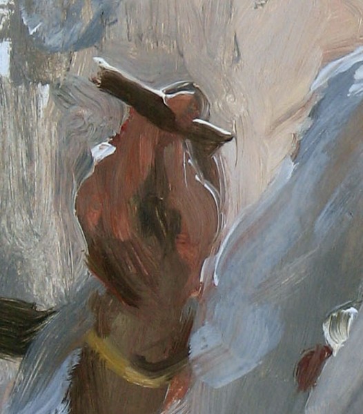
Hark to a jab I made at art historians a few posts ago, that discontinuities in an artist's style are often the results of coping with unfamiliar materials. The following details show an unusually pleasant bout of coping:

July 2, 2009
I worked very hard on the first version of the Eric Rhoads portrait (see June 29): I'd used up the promised two sessions, the magazine had a deadline looming, I felt - knowing better - that I had something to prove, etc; and the more I waged war of attrition on that thing, grinding away at it with the help (?) of photographs, the worse it got; I gradually and then precipitously forgot how to paint. And - I'm not kidding - the paint wouldn't work, it went on strike.
I finally got over myself and decided to call Eric and tell him I'd have to start the painting over and with a different pose; he was perfectly fine with it and agreed to come back to my studio the next day. What a relief.
Then I asked my friend Joseph what he was up to, was he willing to sit for a quick portrait; sure why not, he said.

This practically glided off the palette and on to the canvas - and quickly too; what a joy after all that slugging.
Next day Eric came to the studio. The new, backlit pose felt right to me, though I still cycled through a few false starts until it finally took.
When things are coming along alright, I like to let my neighbors know by tormenting them with my guitar "playing" while I look at the work in progress. Eric recorded this video:
Mortification put up a valiant fight, but exhibitionism won and got me to post this here.
Apologies to BB King fans. And music fans.
June 30, 2009
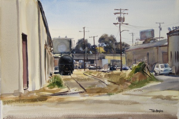
A propos of nothing, I'm posting a couple watercolors. The first is of a railroad spur in Oakland; it's just around a few corners from where I live and, from the other side, where my studio is. It's painted on something called Saunders Waterford paper; I was going to say it was different from my usual stuff, Arches, but every brand, and even varieties of watercolor paper within given brands (I'm looking at you, Fabriano), is radically different from all the others; how do they do it? I think it's mostly due to the sizing employed in the manufacture of the paper: size refers to some sort of glue or gelatin, natural or synthetic, with which the paper is impregnated or coated (internal and external sizing, respectively) to make it receptive of water and watercolor paint in the characteristic manner. When it's not sized, the paper just sucks up whatever you put on it, severely limiting the painter's ability to - paint. (for something more substantial than what comes off the top of my head on this, see the incredible "handprint" website in my Links section)
I hadn't used this paper for years, but had fond memories of it. My memory was not terribly far off, but I did end up doing a more watercolor-y picture than I think I usually do.
Next is a painting done on one of the handmade Indian papers - I think this is "Indian Village." This paper is always out of square and sometimes whimsically sized (in the gelatin sense) but it's usually very nice to paint on, as long as you are careful about layering washes; sometimes paint is shifted from where you put it by subsequent applications, even very gentle ones. I don't really know what it is a picture of, some part of an old bridge maybe, but I like it. A casual painter friend once described a picture I was doing on this sort of paper as "pixelated." A pleasant word: as for what it means in this context, my guess would be "un-watercolor-y. "
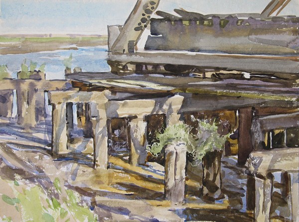
There is a point - pixel? - to this: what may appear to non-painting commentators - sometimes referred to as art historians - to be stylistic aberrations in a given artist's work, can very often be attributed to his or her coping with unfamiliar or recalcitrant materials, eg: weird sizing in the paper.
June 29, 2009
Here's an experiment in non-linear blog writing: I'm flashing back to the past; some short time before the motorcycle trip and a longer one before housesitting in Silicon valley where I made a sally at painting horses....
Just before, and I mean just before leaving for my brother's and the racetrack, I finished up a quick portrait of Eric Rhoads, the publisher of Fine Art Connoisseur magazine. But not quite so quick as all that; I'd told him two sessions of three hours each, but we ended up doing four sessions. I worked the first two days on a picture that kind of bumped along okay, but if I'd listened to the painter inside (to be fair, he/she only whispers) I'd have started over sooner on what became the picture I signed. Here we are the first day:
Yes, I was painting him as he consulted his Blackberry. If I'd had a Blackberry, maybe it would have told me not paint the Blackberry.
Another day of this at the end of which I an idea that felt better: Eric standing in front of my windows, backlit. Long story short, here it is:

Eric Rhoads is a treat to know, and a very good model. He memorizes whatever pose you settle on, and then talks and moves naturally until he sees out of the corner of his eye that you're looking toward him for the next glance/mix/paint, and hits his mark perfectly - over and over! And he was perfectly affable in assenting to my timorous request for more time to work on the picture (actually to start it over).
For those of you like me who resent the fact that you can't generally stick your nose up in the paintings at the Louvre or the Met, you must rely on painter-friends who will let you do so, or on painters who will post large details of their pictures on their websites. Note that I'm not telling you to expect Titians and Veroneses...

The actual painting is 24x18. It will accompany Eric's letter-from-the-publisher in the next issue of Fine Art Connoisseur.
June 19, 2009
Happy Birthday to me - !
I've been in the mood to get out and paint some watercolors. It's been - I don't know - 8 or 9 months. I don't have anything to post yet, nothing I would show anybody; it usually takes me a few paintings before the dust gets blown off the neural pathways, or whatever it is that happens when I stop having to think so hard and seemingly ineffectually about what kind of blotch or smudge to make with which brush, what color and how wet to make it, etc - and start to paint.
I went last weekend with my brother John to a motorsports raceway where he rode the track on his stripped-for-racing Suzuki and I tooled around the compound on a borrowed dirt bike - and scratched at a couple small watercolors.
Here I am working at the first one; I was trying to do something quick of John's (who took the pictures) and Rob's (biker friend in the photo) motorcycles before they hit the track for the day's first session. The look of concentration - or is it consternation - on my face makes gives me a laugh:
 I said on one of the earliest posts on this blog that it might as well be one of the laws of thermodynamics - entropy of course - that if you're painting something capable of moving or being moved, it's going to happen before you're done with your picture. In this case, there was no exception to prove the rule.
Later, not specifically in an effort to appear more dignified by standing, I made a hash of a big-sky-over-parking-lot painting, but at least I finished it. And isn't the photo cool?
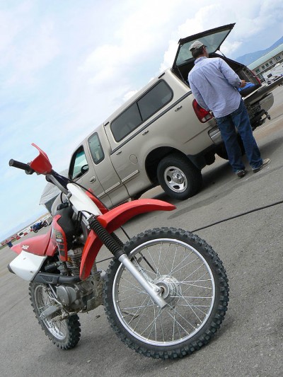 Thanks to John Hughes for the photos.
June 2, 2009
I finished this the day after my last post.
I'm calling it "June morning" because the source watercolor was done on the loveliest morning last June. Lovely, probably, because I was in New Harbor Maine doing watercolors on the shore; what could be better? I was there for an unofficial family reunion that my uncle Barry devised: while I was painting, my brother Glenn came by on a stroll, then my cousin Ruby. Like I said, what could be better?
here's a view of Little Island from one of the cottages we stayed in:
 I know, what could be better?
On to new things. I was flipping through my sketchbooks last week looking for something new to start, since I only have 40 or 50 pictures in progress, clearly not enough. I thought I'd try making something out of this:
It's a page from an old sketchbook (the same one the coffee shop painting came from) with a watercolor note taped to it in more or less the right place. I didn't have the patience this time to do a working drawing; in fact I hadn't the patience to stretch a new canvas; I had an old oil-in-progress that was about the right size and that I decided I'd never finish and flipped it around, gessoed it, and started plopping the new painting on with my version of abandon.
Here's the first session's result:
it's acrylic, by the way.
May 22, 2009
Okay. I didn't finish that painting. I'm still working on it. You know, I've done this sort of thing before, worked and worked ... and worked some more on some big canvas, an unreasonable amount of effort -
- and ripped it up without a backward look.
Here is where we stood on the morning of the 20th:
Maybe I should turn it into a portrait of a white whale.
May 18, 2009
Thankyou to the Banks Gallery for placing a full-paged ad of my work in the current issue of American Art Review, p. 67.
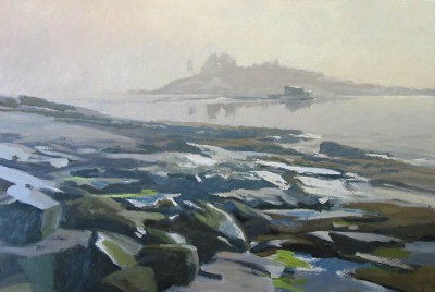
I finished the Big Fog a couple days ago, but I haven't yet taken a postable photo of it. Tomorrow I hope.
Back to watercolors for a minute. Here is a painting done at a boatyard in Essex, MA; the first watercolor
done on my trip east last June, the same trip that brought us Big Fog and Big Fog Junior:
As usual when I haven't done a watercolor in a while, the internal Director of HR pestered me with questions about my qualifications and work history: "Are you sure you've done this before? Why can't you mix the right green? Can you even draw? Perhaps you should take the rest of the day off to reconsider, maybe try again tomorrow..." And as usual I plowed through, affecting not to hear.
I'd been dropped off at the boat yard and wasn't due to be retrieved for some time, so I prepared to do another half-sheet, when it started to rain - I know it looks sunny in the picture above, but it's New England.
I set up under the eaves and to leeward of a small shed located to the right and beyond the trees in the picture, and could only face the one way without getting too wet. Embracing freedom from choice, I went to work:

History may not declare this the ne plus ultra of Essex boatyard watercolors, but I find it pleasantly of-the-moment and redolent of that lovely feeling of solitude you can have when you're the only person around without sense to come in from the rain. It is also an example of what works well for me: paint a picture; paint another one; then paint another: they only get better over time and the requisite wilful obliviousness sends that martinet from the personnel department back to his cubicle.
For fun, here's a quick self-portrait I did a couple months previous to the one from several posts ago; another glasses-job in black, vermilion and ochre.
 oil/panel 16x12
May 7, 2009
This old picture illustrates pretty well why I like doing watercolors.
I added a few more pictures to the watercolor gallery today. Instead of painting them all the time like I used to, I now go on watercolor jags for several weeks or a month at a time. It often takes a few sheets to get the feel back, or to feel like I've got the feel.
For those who care, the photo above was taken 6 or 7 years ago in the Little Lakes Valley in the Eastern Sierra Nevada. I'm working on an Arches 555 lb sheet, 29.5 x 41. I know, crazy. The palette is a regular John Pike.
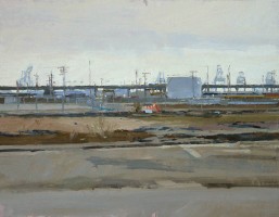
Here's one I did from a hill overlooking the Port of Richmond last fall, unusual because I'm not much of a view guy and I seldom make for the high ground when looking for a painting spot. Is the mound in the center a titanic beehive? Ant hill? I don't know what it is, but it's surrounded by railroad boxcars, autos in a parking lot, cranes, cargo ships, oil tanks...

On a trip with my brother to Mt. Shasta a year or so ago, we went to the town of McCloud - here's one of the results -

Referring to the beginning of this post, I felt while doing this that I was clunking along; but it looks okay to me now that it's marinated for a year in a pile of other watercolors. Info for the watercolorers: this is done on one of those handmade Indian papers you can get from the mail-order houses - Nujabi. It's a full-sheet, more or less; the manufacturers have the artists' temperament: not slaves to right angles and straight edges. Nice surface though.
Here's a great website for people who like to geek out on watercolor tools: http://www.handprint.com/HP/WCL/water.html
May 1, 2009
Quick update on Big Fog; the boat is in fact going to the left, as predicted, but not after at least 5 paintings and scrapings-out of it, further, closer, back to the right, coming, going. Think I've cracked it though. Basic changes made in the atmosphere and the water - I had worked and worked on the subtle colors in the sky; nacreous rose-gray on the left graduating to a warmer backlit mist on the right, clearing and brightening above - the photos I've posted in this blog don't show all this... You wouldn't believe how much work goes into this kind of thing, at least when I do it. Yesterday I realized what I already knew: The pretty colors have to make way for the unified effect. So I scrabbled a carefully prepared non-color all over the place, much better.
here's a snapshot:
April 22, 2009

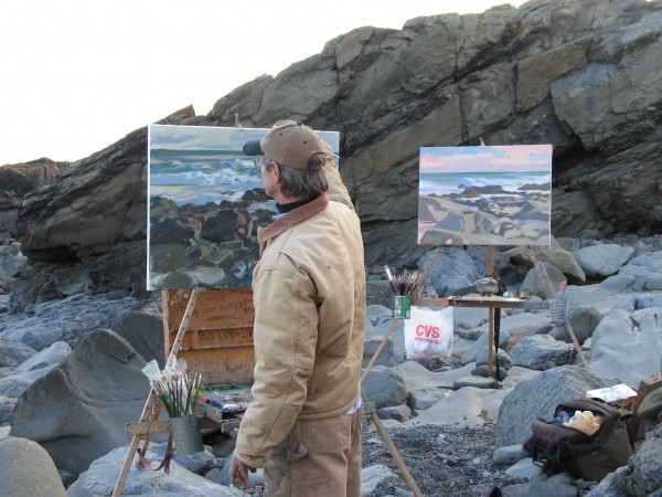
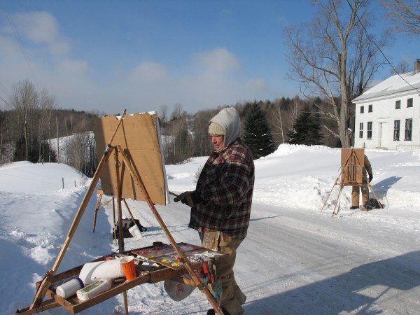
Here I am doing a portrait demonstration in Danville last week. Look to the right of the picture; there's a self-portrait I did earlier that day. I thought that I might be out of "practice" and better get my hand back in, but I'm pretty sure I did it out of token conscientiousness: I don't have what you might call an encapsulable step-by-step method, full of rules-of-thumb like picturing the head as an agglomeration of geometric objects, or dividing the face into three strips, or "the nose and cheeks are warm, the forehead and chin cool", etc, etc. Sometimes you can come out of months' hibernation and do the greatest thing you've ever done, just as you can always have a bum day, no matter how much you work; and I wanted to have something fresh and rapidly-done to show to the audience, or maybe to myself.
You may ask what do I talk about to explain what's happening in my demonstration? I approach it more as a painting improvisation than as specifically a portrait demo, concentrating on observation, the visual idea, practical aspects of painting, your great freedom of choice and action, plus a whole lot of stream-of-consciousness and jokes. I like to be asked questions by audience members. There's a lot of talk, and what the audience sees is probably more of the next photo than of the picture above: gesticulation, possibly dubious looks from the model, spilling of the contents of the palette cup (I noticed splashes of painting medium on the floor when I was finished, hoping no one else did, until the imp of conscientiousness - a grateful nod to Neal Stephenson and his character Jack Shaftoe - prompted me to point it out to the kind people who hired me.)

By the time this pic was taken I'd removed the little microphone attached to my shirt; any breathing I did from my nose resulted in improbably loud, harsh sounds coming from the direction of the amplifier; I really thought someone was dragging furniture around in an adjacent room...
But back to the self-portrait:

I dislike wearing glasses when I work, but I like painting them.

I used a pretty limited palette: white, ochre, vermilion, black, ultramarine. Take away the ultramarine and many painters will recognize this as the Zorn palette, after Anders Zorn (Swedish, 1860-1920). I don't think he was unusual in his frequent use of such a limited palette but he was unusual in his total mastery of its possibilities. Anyway, I tried to do this thing quickly but without rushing, if that makes sense.
Following up on old news, I resumed work on the big Little Island painting last heard from a few months ago. Here are the results of the latest "sittings."
 I know you think that nothing is happening with this thing. Or is that what I'm thinking? Anyway, I can already tell you that the next update will have the boat pointing in the other direction - again.
April 3, 2009
Event: I'll be doing a portrait demonstration for the Alamo Danville Artist's Society on Tuesday, April 14 at 7:30 pm at the Danville Congregational Church, 989 Danville Blvd, Danville, CA.
How cool is this picture - it's my brother Glenn and I painting in Oakland a couple years ago.

When I paint outdoors around here - an on-and-off activity - as often as not it's with Glenn; no better way to spend time together: fresh air, jokes, gnashing of teeth...
Speaking of which, a pic from another day, this time in the hills in Marin County. It was windy enough to take down my easel, weighed down with pack and rocks, and flip it end over end, brushes flying all over.. video would have been funny.

March 14, 2009
A few more pictures added to the slide show; two of them still wet. One of these is the coffee shop painting.

I did the sketches 10 or 12 years ago in Francestown, NH, and have only now made something from them. Take a look at this one:
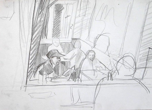
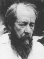
I changed a few things in the final painting: the reader at the counter is no longer apparently a railroad conductor, one of the figures at the back table is gone, and the waitress's reflection in the mirror is opacified to conceal...
Aleksandr Solzhenitsyn?

March 3, 2009
I've added a new gallery; a selection of paintings done from drawings in my sketchbook, with the sketches and preparatory drawings included. There'll be more; I'm working on at least 4 or 5 others, in addition to the other ongoing studio pictures highlighted here - though I suppose if I add too many more of the big fog picture before it's finished I'll have to rename this page "What's Old."
The newest picture in the slide show is "Tea." I'd been running across these scraps in my miscellany drawer for years -

until I finally put together a working drawing -

I had some big vague idea about doing the picture all in red with weird accents, but, as usual, the actual painting went where it would.
For fun, I started with a bright green imprimatura - you can see it peeking through in places - and found that it made every mark, no matter how dull, gray, colorless, into a vivid pink by contrast.
Of course, once you plaster over all the green, like I did, the vividness goes.

February 18, 2009
I returned last week from a visit to the Northeast - Providence and northern Vermont. Painted small and middle-sized oils, froze feet and fingers, blew nose.
That's Peter Miller on the left, and T. M. Nicholas on the right.
I've been working on the big fog picture.
These are the 6th and 7th sessions; I've left out the 4th and 5th, not that anyone minds.
Here are the other two watercolors I mentioned.


Note the waterline changes. Maybe I can substitute tidal accuracy for artistic merit.
January 14, 2009
I interrupt my last progress report with a newer, unrelated progress report: I decided to put aside the Ashuelot acrylic for a while and do the sensible thing; a 4x6 foot oil from a quick half-sheet watercolor, but with completely different light conditions. No-brainer, right?
Here's the sequence so far, starting with the watercolor.

It's a view of Little Island just off New Harbor in Maine, done last June. I don't really know what to make of this thing, I just really enjoyed being there -

First shot, lots of canvas to cover.

Second go, the taped lines are me thinking about cropping it to a square. Am also turning the clock back a little to the foggy early morning.

Third round. Did I mention there was a lot of canvas to cover? By this time, I've been consulting two other watercolors done the same day along the same little stretch of coast, one for a lit-up fog effect, the other for some more info about the island.
Meanwhile, I've started a portrait:

The arrows point to what you can't have too many of: clamps. Clamps do for painting what tape does for the rest of the world. Note old-school single-post easel; great design - as long as you have clamps.
December 17, 2008
Yesterday I resumed work on an acrylic adapted from a watercolor that I did in New Hampshire a few years ago. The watercolor is "busy" - I'm being charitable - but I keep thinking I can get something decent out of it:
 I'd already tried and flubbed a large horizontal format version in oil. So I thought I should mix it up a little - try it vertical, in acrylics.
Here it is after 3 sessions, 40x30:
btw, I did another watercolor immediately after the first; I like this one:
 The location is the Ashuelot River, near Keene, in November. The orange-colored bits are oak leaves; the other foliage is long gone.
December 14, 2008
I've just added some new (and old) paintings to the site. I was painting with my brother Glenn on the latest one two days ago in Oakland. I'm not much at giving florid names to my pictures but I've topped myself in the non-title department with this one: "Landscape." But take a look at it...
There was a sort of gravel pit behind us, with a bulldozer dozing at the top. A man in a car stopped to ask Glenn what we were up to while we were looking around for a place to set up; hearing the unlikely reply, he said, "That's a different drummer."
A somewhat older picture but a favorite of mine is this self-portrait:

I was staying with a cousin in New Hampshire a few years ago, and on the first day of my visit, after having painted outside all day I went to bed, but lay there thinking I was being lazy: get up! get to work! etc. So I got up, looked around and like Narcissus at the pool, saw my reflection in a darkened window, but rather than falling in love with the old image, thought, well why not paint that? The fun part for me was my impromptu palette of white, raw umber, cadmium red, yellow ochre, and cobalt blue.
Other news is that I have seven pictures in a show at The Thomas Reynolds Gallery called "Small Treasures."
(http://www.thomasreynolds.com)
September 11, 2008
Yesterday I went out in the afternoon to do a watercolor - after a long drive around just looking for trees and fields, I ended up 50 yards up a "private road" in a turnout looking across at a few oaks on a grassy slope. A woman on an ATV came along; I asked her if she thought I'd be okay and out of the way here for a few hours, "I don't think it'll be a problem, I can't imagine anyone bothering you..." A half hour into the full-sheet, a car slowed and stopped; "This is a private road you know," said the lady in a tone of controlled outrage. I looked at her and said, "uhh" and she went on about all the traffic needing to use the pullout on a road studded with pullouts.
"So you want me to leave?"
"I think it would be good idea," and she left, her joy-killing work done.
I elected to stay and wait for the Philistine army but was in fact finally run off by a growing group - I almost say swarm - of yellowjackets buzzing around and bumping my arms and legs.
Here are the big fog picture and it's source watercolor.
September 9, 2008
Well, I refinished the foggy cove picture this morning, even resigned it.
My father James Hughes is a painter; he once told me it's practically a law of nature that as soon as you get into an outdoor painting which includes a boat, the boat will leave. We've since found that other, less likely objects flee the site as well; today I was doing a watercolor in the Port of Oakland which included a couple of those monstrous cranes that load and unload the shipping containers. Twenty minutes into it, both cranes, completely unashamed, glided right out of the picture.
September 2, 2008
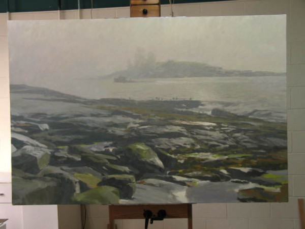
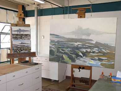
I've been working in the studio mostly, lately. I just finished, or at least signed, a big acrylic done from a watercolor of a foggy little cove in Maine; I know, pretty original, huh. Like I said, it's signed, but I'm letting it sit for a few days to marinate, whereupon it'll tell me if I'm really done or not.
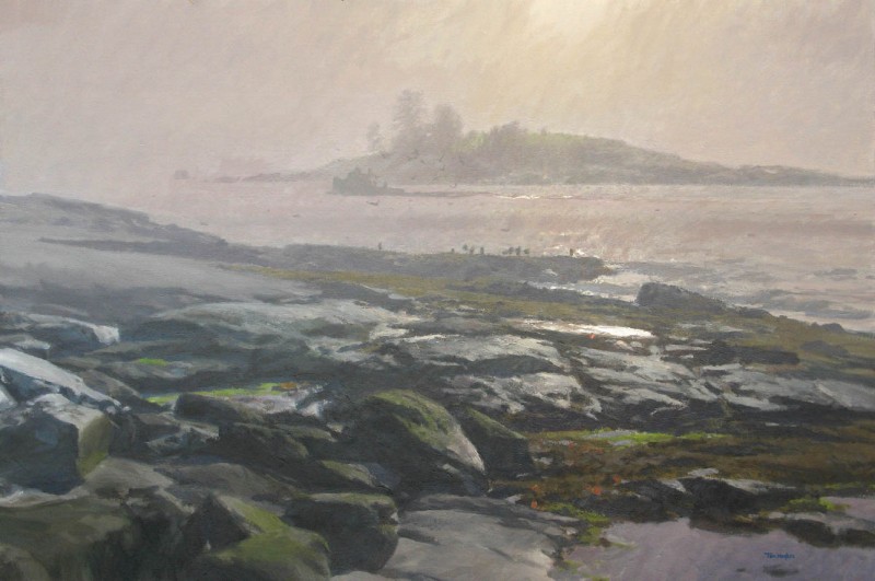
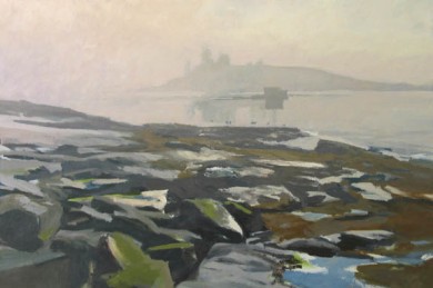
My latest oil landscapes have both gone to the Banks Gallery in Portsmouth, NH (www.thebanksgallery.com) for specific shows; one, a typical New England fallow field in early spring with a bank of pines behind, at the back of which looms Mt. Washington all snowy, for a White Mountain show, currently up. The other for an upcoming Mount Desert Island show, is a look from the rocks off the Park Loop Rd in Acadia National Park near Bar Harbor in Maine.
Otherwise, I'm picking away at various projects and going out every couple days to do watercolors. Maybe I'll post some of the works-in-progress...